This worked example is intended to serve as an introduction to the affylmGUI package and to provide an illustration of its most important features.
The experimental data set used to illustrate the software's functionality is described in the "Estrogen 2x2 Factorial Design" vignette by
Denise Scholtens and Robert Gentleman, included with the Bioconductor package factDesign. The following description of the experiment
is taken from that vignette.
"The investigators in this experiment were interested in the effect of estrogen on the genes in ER+ breast cancer cells over time. After serum starvation of all eight samples, they exposed four samples to estrogen, and then measured mRNA transcript abundance after 10 hours for two samples and 48 hours for the other two. They left the remaining four samples untreated, and measured mRNA transcript abundance at 10 hours for two samples, and 48 hours for the other two. Since there are two factors in this experiment (estrogen and time), each at two levels (present or absent,10 hours or 48 hours), this experiment is said to have a 2x2 factorial design."
The table below describes the experimental conditions for each of the eight arrays.
| Name | FileName | Target |
|---|---|---|
| Abs10.1 | low10-1.cel | EstAbsent10 |
| Abs10.2 | low10-2.cel | EstAbsent10 |
| Pres10.1 | high10-1.cel | EstPresent10 |
| Pres10.2 | high10-2.cel | EstPresent10 |
| Abs48.1 | low48-1.cel | EstAbsent48 |
| Abs48.2 | low48-2.cel | EstAbsent48 |
| Pres48.1 | high48-1.cel | EstPresent48 |
| Pres48.2 | high48-2.cel | EstPresent48 |
The file (shown as a table above) is known as the "RNA Targets" file in
affylmGUI. It should be stored in tab-delimited text format and it can be created
either in a spreadsheet program (such as Excel) or in a text editor. The column headings must appear exactly as above.
Each chip should be given a unique name (in the Name column) to be used to create default plotting
labels. Here, short names are used to ensure that the labels fit in the space available on the plots.
The Affymetrix CEL file name should be listed for each chip in in the FileName column. The Target
column tells affylmGUI which chips are replicates. By using the same "Target" name
for the first two rows in the table, we are telling affylmGUI that these two CEL files
represent replicate chips for the experimental condition (Estrogen Absent, Time 10 hours).
Note the we could use a different Targets file for this analysis in which the time effect was
ignored if we only wanted to compare Estrogen Absent and Estrogen Present. This would simply
require removing the 10's and 48's from the Target column.
The data for this worked example is available at http://bioinf.wehi.edu.au/affylmGUI/DataSets.html.
REQUIREMENTS FOR RUNNINGaffylmGUI
To use affylmGUI you will need R 1.8.0 or later, and at least the default packages
from Bioconductor installed using:
> source("http://www.bioconductor.org/getBioC.R")
> getBioC()
You will also need the tkrplot R package (on CRAN), which can be installed with
> install.packages("tkrplot")
If you want to use probe-level linear models you will need the affyPLM package from Bioconductor,
and if you want to export HTML reports, you will need the R2HTML and xtable packages
from CRAN, which can be installed in the same way as tkrplot above. After you have installed
the default Bioconductor packages with getBioC, you can install additional Bioconductor packages such as
affyPLM with:
> library(reposTools)
> install.packages2("affyPLM")
affylmGUI requires the Tktable and BWidget Tcl/Tk extensions which are
not included in the minimal Tcl/Tk installation which comes with R. If using Windows, you can install Tcl/Tk from
the ActiveTcl distribution (http://www.activestate.com/ActiveTcl)
and affylmGUI should automatically find it in the Windows registry. If using Linux/Unix or Mac OSX, ask
your I.T. administrator to install Tktable and BWidget from http://tktable.sourceforge.net
and http://http://tcllib.sourceforge.net respectively.
Generally, you will not need to explicitly specify Chip Definition Files (CDFs) and Annotation files every time
you run affylmGUI. This information is automatically downloaded from the Bioconductor website where
possible and installed as R package(s). For this reason, it is best to use affylmGUI on a computer connected
to the Internet. If you are using chips which are not listed on the Bioconductor site, you may be interested in
looking at the Bioconductor packages, makecdfenv and AnnBuilder, however most
affylmGUI users should be able to use the existing CDF and annotation packages on the Bioconductor site.
The screenshots below are taken from Windows. We start by opening RGui and typing :
> library(affylmGUI)
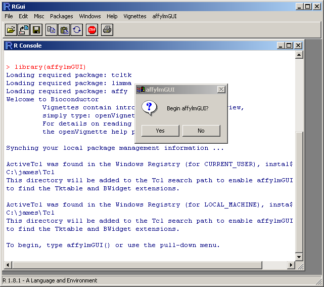
Click "Yes" in the message box above to begin affylmGUI
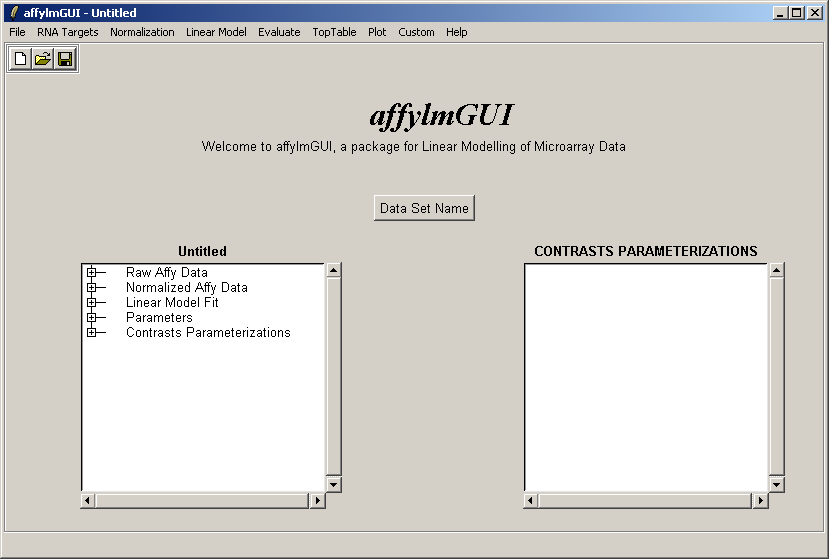
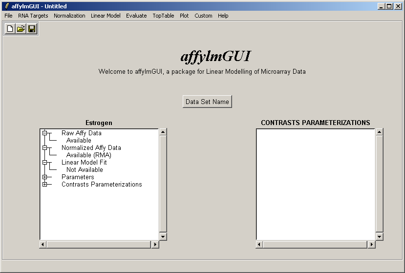
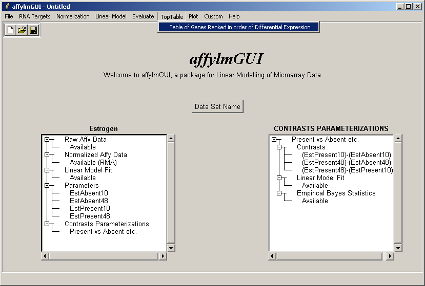
The main window of affylmGUI is shown above. From the File menu, click on "New" to begin a new analysis.
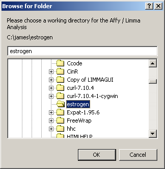
The first thing you must do is to specify a working directory for the analysis. This directory should contain your Targets file and your CEL files. You should not need any CDF files. These will be downloaded from the Bioconductor site automatically.
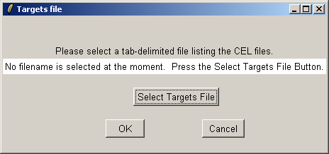
Now click on the "Open Targets file" button to open the targets file for the estrogen data.
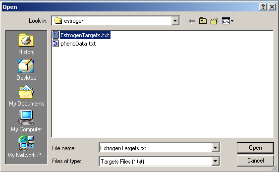
Select "EstrogenTargets.txt".
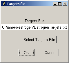
Click "OK". The data from the CEL files will now be read from disk. When affylmGUI has finished
reading in the data, you will be prompted to enter a name for the data set.
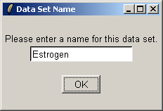
Give the data set a name, which will become the default filename when you save your analysis or export an HTML report.

After the data has been loaded the left status window is updated in the main affylmGUI window.
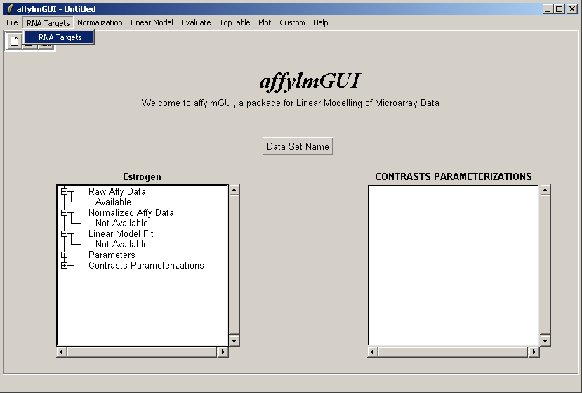
The RNA Targets can be viewed after having been loaded into affylmGUI using the "RNA Targets" menu.
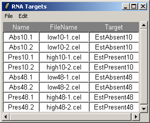
The RNA Targets are shown above. The RNA Targets table/input file is described in the introduction.
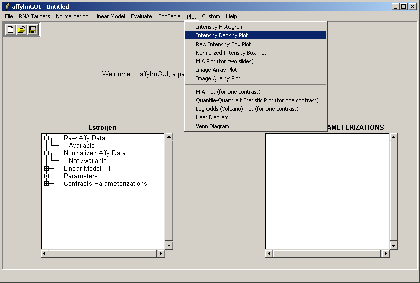
From the Plot menu, select "Intensity Density Plot".
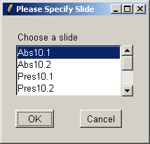
Select the first array.
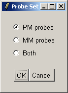
Choose to include the PM (Perfect Match) probes in the density plot.
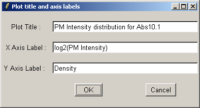
If desired, you may customize the plot title and axis labels.
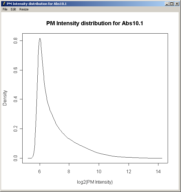
The density curve above shows the distribution of Perfect Match (PM) intensities across the first chip.
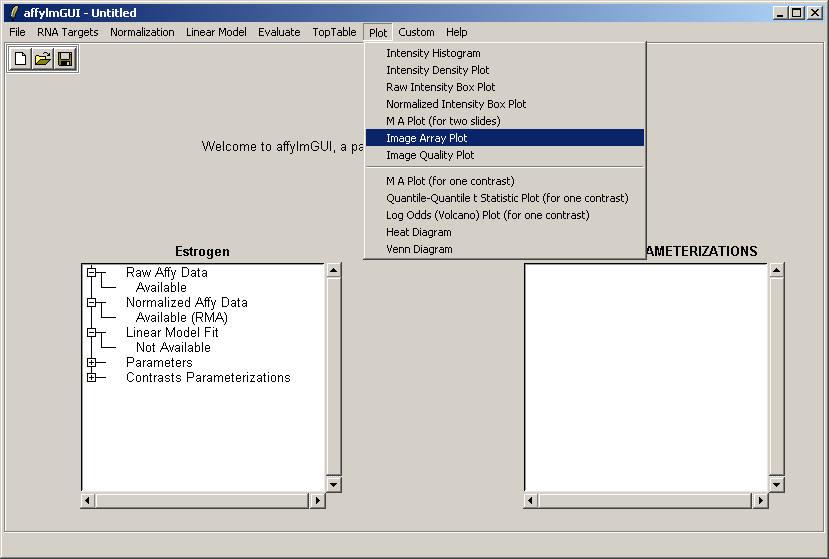
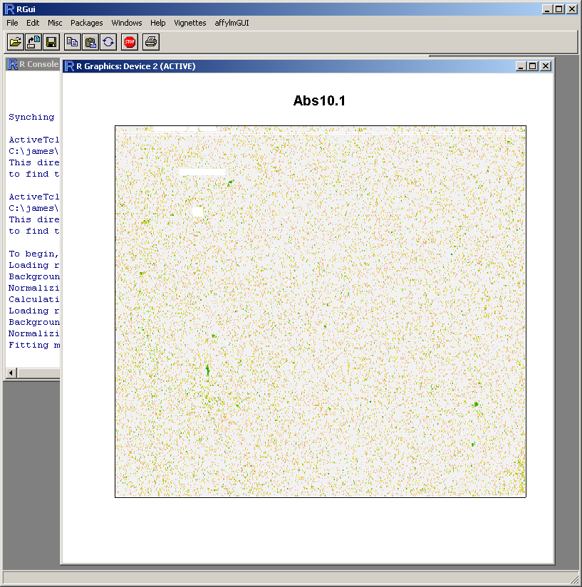
From the Plot menu, select "Image Array Plot".
Select the first array.
If desired, you may customize the plot title and axis labels.
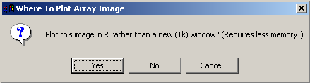
This plot requires a relatively large amount of memory, so the user is given the option of plotting the graph using a standard plot window within the R statistics environment rather than using a Tk window, as this is likely to use less memory.
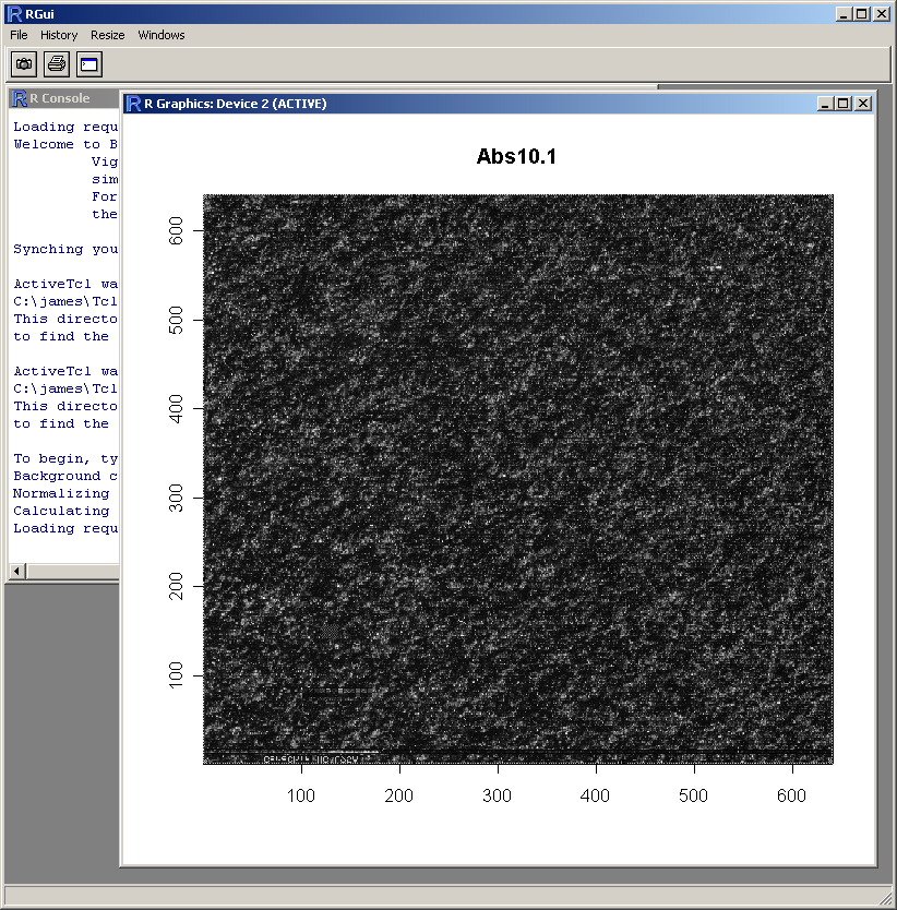
The resulting image plot is shown in R (above). This type of plot can be used to identify spatial artefacts such as scratches or smudges or boundary effects.
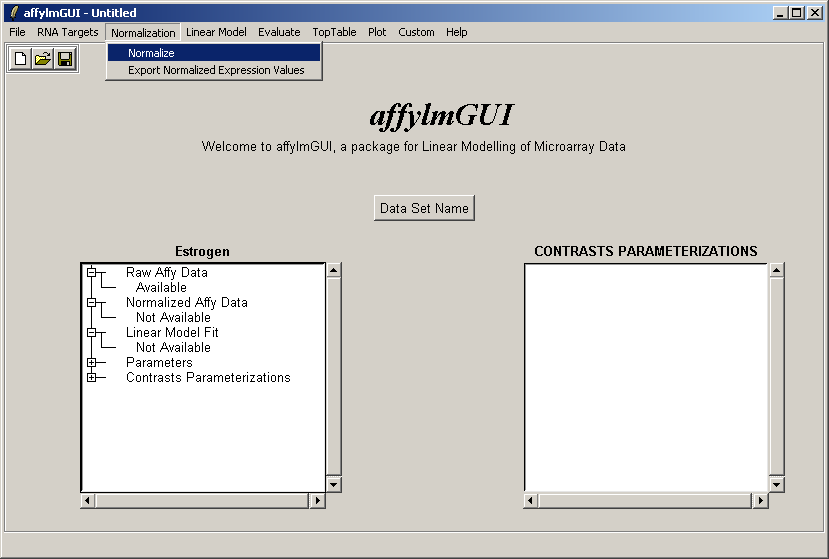
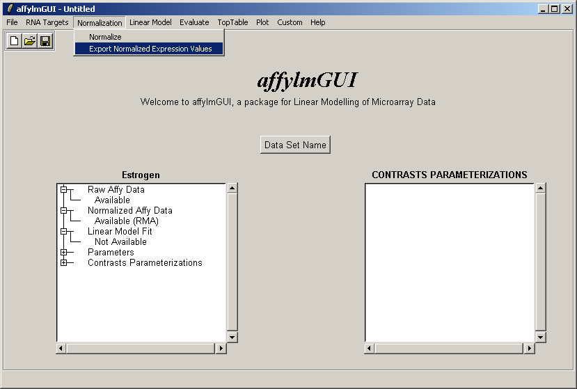
Now from the Normalization menu, select "Normalize". This menu will soon contain options to export normalized data to
tab-delimited text, but for now this can only be done by using the R command write.table in an
"Evaluate R Code" window.
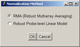
There are two normailzaton methods available: Robust Multiarray Averaging (RMA) and Probe-Level Linear Models (PLM). For now we will use RMA (which is faster).
The left status window now reflects the fact that normalization is complete. For users who are familiar with some R commands, the raw and normalized data objects are available as "RawAffyData" and "NormalizedAffyData" in the "Evaluate R Code" window, found in the "Evaluate" menu.
You can export the normalized expression estimates to a tab-delimited text file which can then be opened in a spreadsheet program such as Excel.
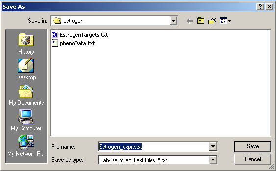
Save the tab-delimited text file in a conveninent location.
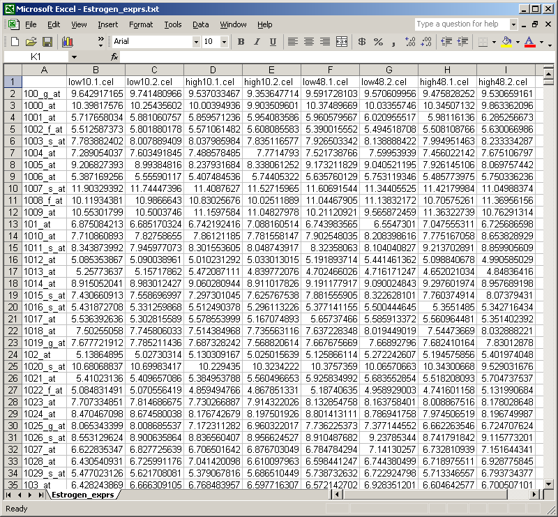
The table of normalized expression values can then be imported into Excel.
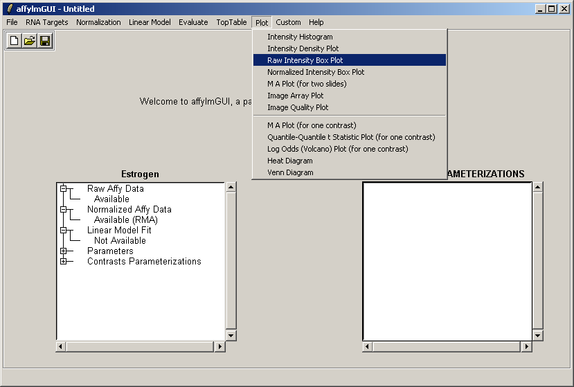
From the Plot menu, select "Raw Intensity Box Plot".
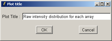
If desired, you may customize the plot title.
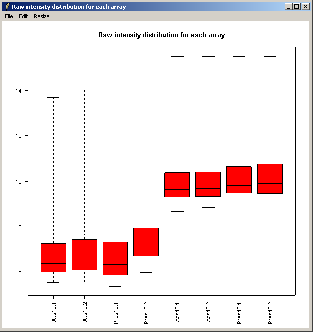
The resulting plot is shown above. Next we will show the same intensity box plot using normalized data. The normalization will remove effects seen in large proportions of the data (in this case a time effect is obvious) while still preserving effects seen in small proportions of the data. We hope that we will find a small number of genes with significantly different expression levels between the non-replicate arrays and that these genes do not make up a large enough proportion to seriously question the assumptions of normalization. Generally normalization of microarray data does more good than harm, because it removes artificial biases due to the technology rather than the biology.
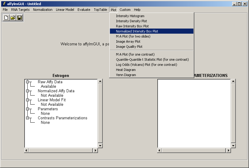
Select "Normalized Intensity Box Plot" from the Plot menu.
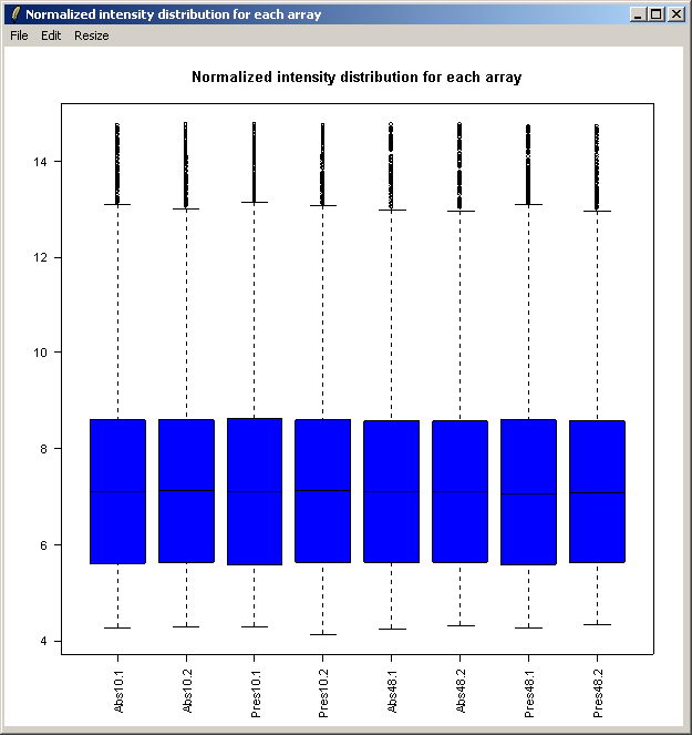
The resulting plot is shown above.
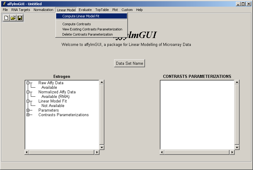
Now select "Linear Model Fit" from the Linear Model menu. The linear model is used to average data between replicate arrays and also look for variability between them.
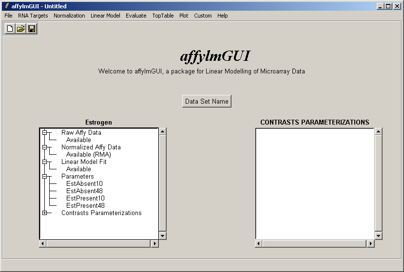
The status window on the left is updated after the linear model has been computed (above). Advanced users can
note that the linear model fit
is available as an object called fit which can be accessed from within the "Evaluate R Code" window.
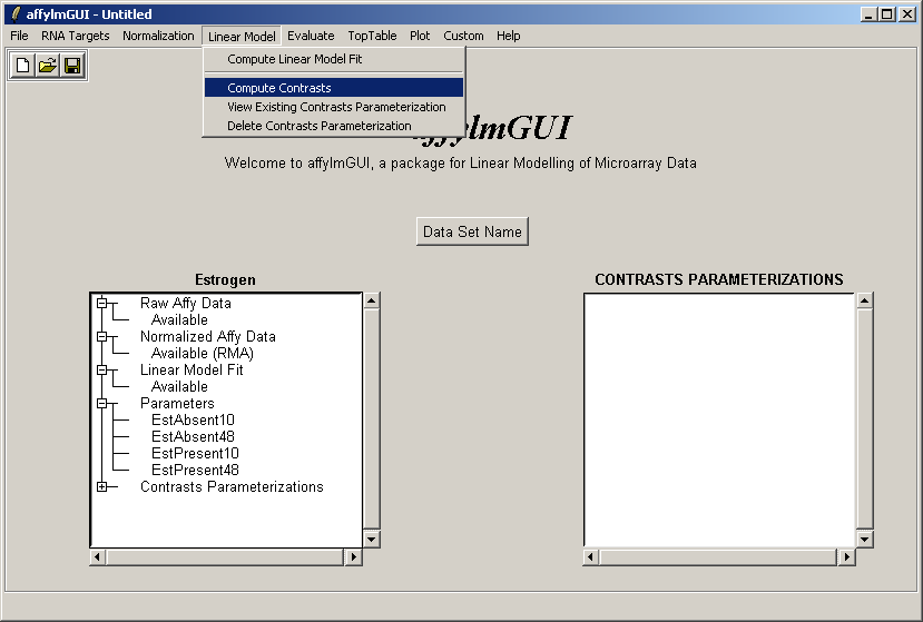
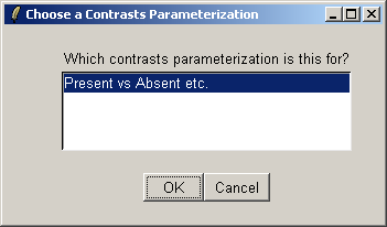
The comparisons of interest between the arrays are specified as a contrasts parameterization. From the Linear Model menu, select "Compute Contrasts" which will prompt you to specify the comparisons of interest, either by selecting pairs of chips to compare or by entering a matrix.
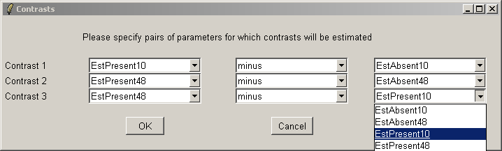
Here we will compare Estrogen Present with Estrogen Absent at the two different times and also make a time comparison for Estrogen Present. Note that if you want to simply compare Estrogen Present with Estrogen Absent, you will need to modify the Target column of the Targets file and begin a new analysis.
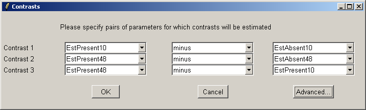
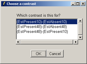
The "Advanced" button can be used to enter the contrasts as a matrix or to see the corresponding contrasts matrix obtained from the paris of arrays selected. The number of pairs of drop down combo boxes is chosen to be one less than the number of unique targets in the Target column of the Targets file as long as this does not exceed ten pairs in total. For now, this total number of contrasts must be the same for all contrasts parameterizations, but you can just leave some of the blank if desired. For example, you may choose to use only one comparison, EstPresent10 vs EstAbsent10.
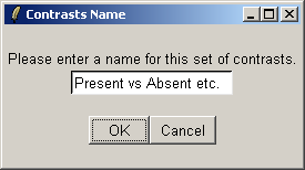
You must give a name for this choice of comparisons.
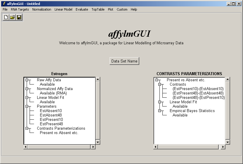
Now the right status window reflects the choices made in defining the contrasts parameterization and tells us that
a linear model fit has been computed for this set of contrasts (i.e. log ratios have been estimated) and empirical
Bayes statistics are available: P-values, moderated t statistics and B statistics (log odds of differential expression).
Empirical Bayes statistics will only be available if you have replicate arrays. It is possible to do some basic
analysis in affylmGUI if you do not have replicate arrays - in this case evidence of differential expression
will be judged purely by fold change - but the real strength of affylmGUI is in combining the fold change
estimates with the variability between replicate arrays to provide confidence levels for differential expression in the
form of P-values, moderated t statistics and B statistics.
Now from the Toptable menu, select "Table of Genes Ranked in order of Differential Expression".
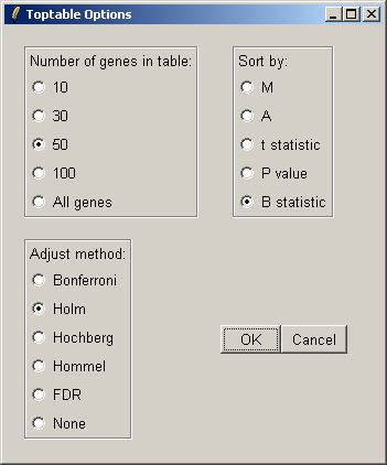
You can specify the number of genes you want to display in the table. If you want to display all genes, the table will be shown in a text window, because the usual spreadsheet/table window is too slow in this case. If you have replicate arrays, you will be able to sort by the B statistic, the moderated t statistic or the P-value. The B statistic is the recommended statistic used for sorting genes. The adjust method is used to correct the P-value for multiple testing error. The default method is that of Holm (1979), but other methods such as False Discovery Rate (FDR) are available.
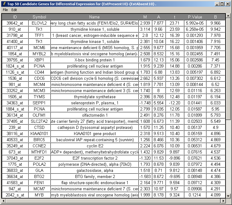
The resulting table is shown above. This table can be saved as tab-delimited text and then opened in a spreadsheet program such as Excel. Genes with low P-values, large (absolute) t statistics or large B statistics are judged by the limma package to be differentially expressed with some reasonable consistency between replicates.
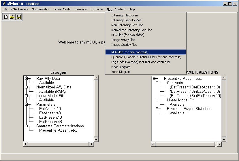
Now from the Plot menu, select "M A Plot (for one contrast)".
There is only one contrast parameterization available, so click "OK".
Choose the first contrast, (EstPresent10)-(EstAbsent10).
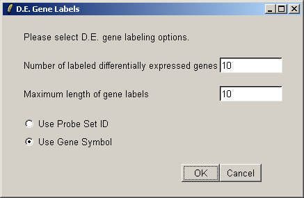
We will label the top ten differentially expressed genes as ranked by the B statistic, using the gene symbols for labelling.
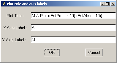
If desired, you can customized the title and axis labels for the plot.
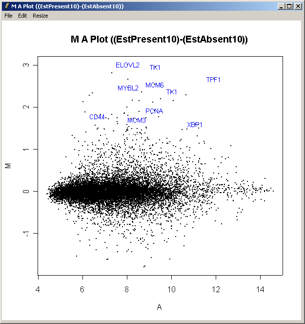
The resulting plot is shown above. All of the genes judged to be differentially expressed appear to be up-regulated, i.e. they have positive log2 fold changes. More information about these genes can be found in the toptable (shown previously).
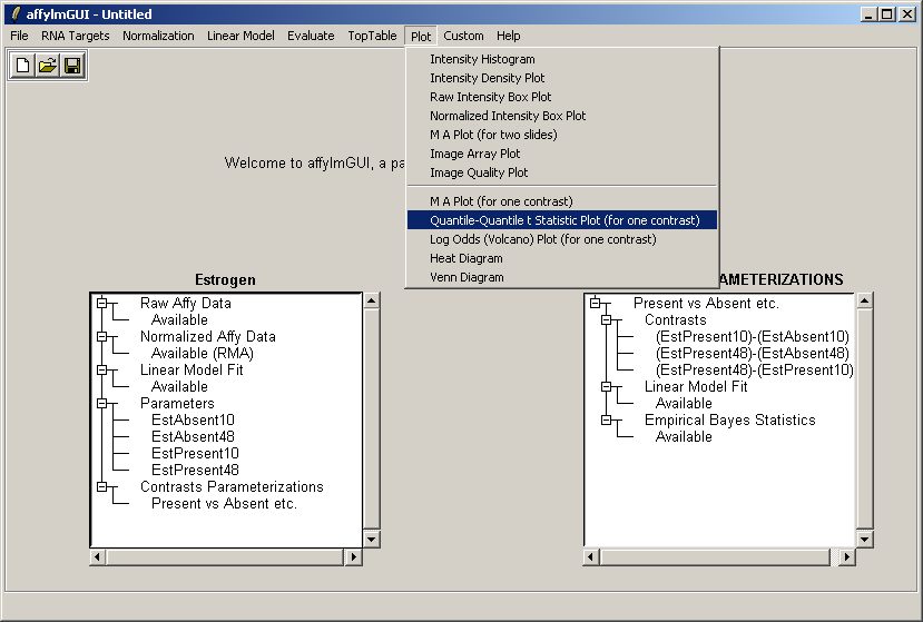
Now from the Plot menu, select "Quantile-Quantile t statistic plot (for one contrast)".
Choose the second contrast this time.
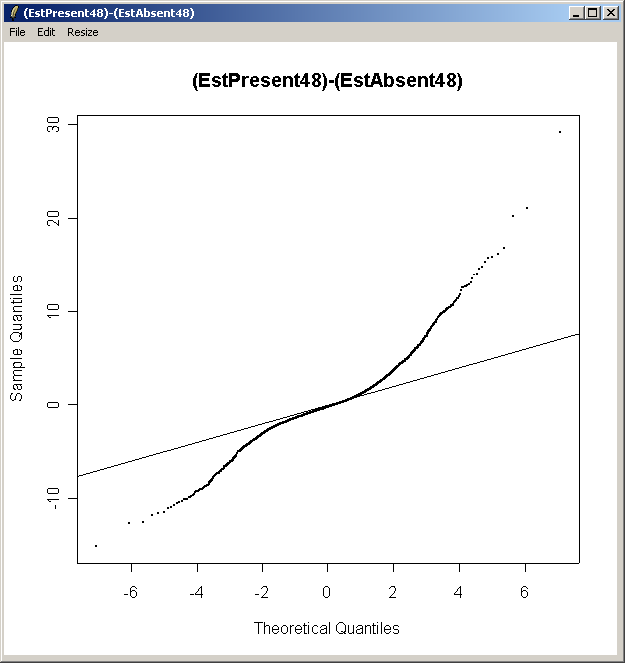
From the QQ plot, there is plenty of evidence of differential expression, i.e. there are plenty of points far away from the line of slope one. The same conclusion can be drawn by looking at the number of genes with low P-values, large t statistics and large B statistics in the toptable.
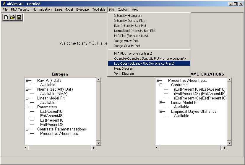
Now from the Plot menu, select "Log Odds (Volcano) plot (for one contrast)". Select the first contrast, (EstPresent10)-(EstAbsent10).
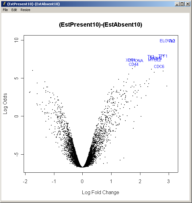
The resulting plot is shown above. This shows the relationship between the B statistic (log odds of differential expression) and the log fold change (M). Unlike the log fold change, the B statistic takes into accound the variability between replicate arrays.
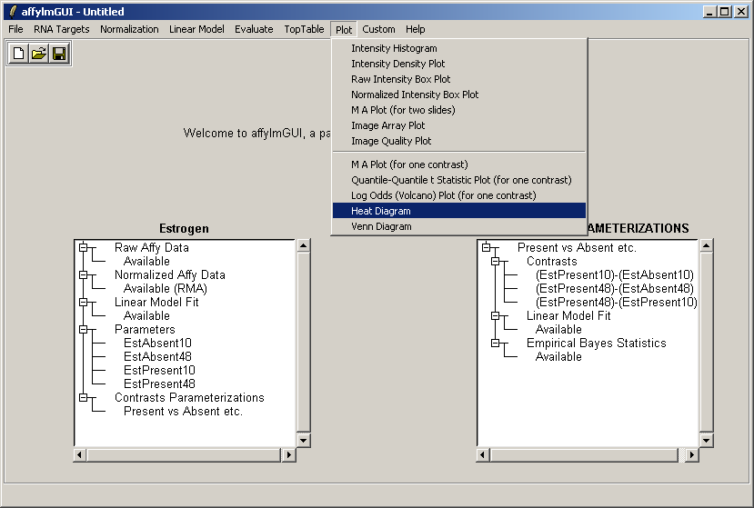
Now from the Plot menu, select "Heat Diagram".
There is only one contrast parameterization, so click "OK".
The heat diagram is plotted relative to one contrast. Choose the first one, (EstPresent10)-(EstAbsent10).
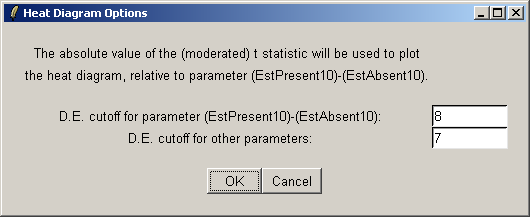
The heat diagram only displays a subset of genes. You can choose a cutoff based on the t statistic to define a set of differentially expressed genes. The primary cutoff is for the contrast selected in the last dialog, and the secondary cutoff is for the other contrasts.
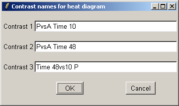
We will use short contrast names so that they fit easily on the plot.
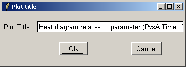
The title can be customized.
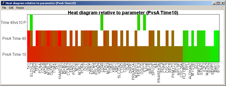
The resulting heat diagram is shown above. The contrast which the heat diagram is plotted relative to is shown at the bottom. This diagram shows which other genes are up-regulated or down-regulated when this genes expression changes from its most down-regulated state (green) to its most up-regulated state (red) within this differentially expressed subset of genes.
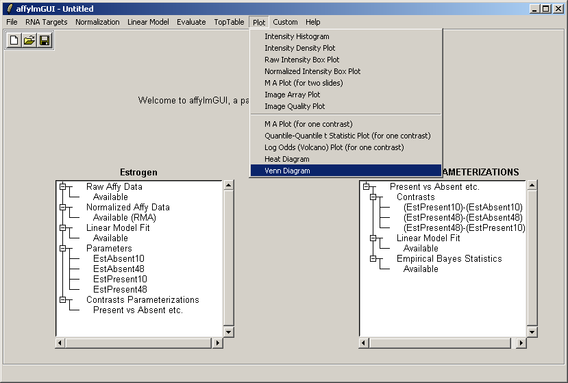
From the Plot menu, select "Venn Diagram".
There is only one contrast parameterization, so click "OK".
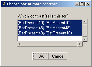
Select all three contrasts to be used in the Venn diagram.
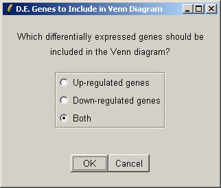
Select both up-regulated and down-regulated genes to be included in the sets in the Venn diagram.
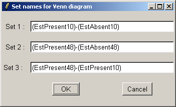
The set names can be customized if desired.
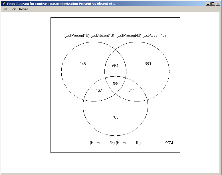
The resulting Venn diagram is displayed above.
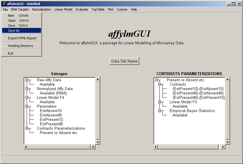
If you haven't already done so, you should save your work, by selecting "Save" from the File menu. This will save a binary RData file with the extension ".lma" (Linear models for MicroArrays).
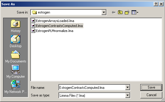
Save the file in a suitable location.
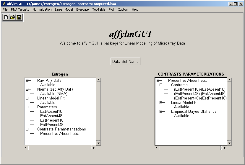
The file name is now displayed in the title bar.
There are currently two normalization methods in affylmGUI, Robust Multiarray Averaging (RMA) and
Probe-level Linear Models (PLM). If PLM is used, than affylmGUI some weights are calculated during the
probe-level linear modeling which can be used to create spatial quality plots for the arrays.
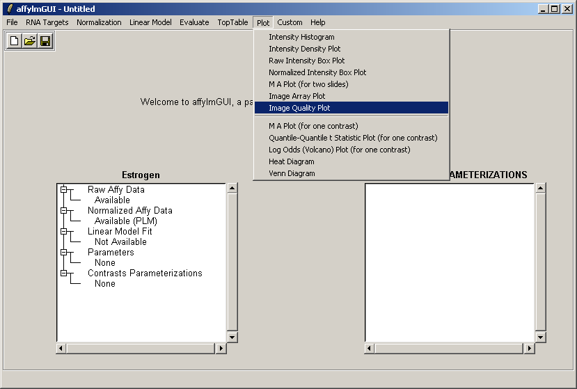
Normalize the data with PLM (using the Normalization menu). Then, from the Plot menu, select "Image Quality Plot".
Because this probe-level plot can potentially use a lot of memory, there is an option available to plot it in the usual R graphics device (shown above for Windows). Along with the image plots shown earlier, this plot can be used to identify spatial artefacts such as scratches or smudges or boundary effects.
Thanks to Scholtens et al [1] for providing the estrogen data on the Bioconductor site (http://www.bioconductor.org/).